Redesigning JustCall AI Dashboard
Duration
2 Days
Industry
SAAS
Role
UX Strategy
UI Design
As part of a product design challenge to redesign the dashboard, I documented the process of enhancing both the overall user experience and interaction flow.
I have detailed the design thinking that guided each decision, focusing on creating a more intuitive and engaging interface.
🤔 Setting up the Knowledge Base:
As part of my design process, firstly I set up a knowledge base to thoroughly understand JustCall AI’s functionality, user base, and the current dashboard's specific challenges.
My primary goal here is to familiarize myself with how the product operates, the key features it offers, and the typical user scenarios to identify any usability issues and areas for potential enhancement.
Centralized Monitoring: I learned that the JustCall AI dashboard functions as a central hub, allowing users to easily monitor and analyze calls, view histories, and assess communication quality in one place.
AI-Powered Insights: The dashboard’s AI-driven insights, like sentiment analysis and topic detection, help managers gauge customer sentiment, track agent performance, and identify recurring themes across calls, adding depth to the call analysis process.
Efficient Filtering and Customization: JustCall AI’s filtering options enable users to quickly locate specific calls and customize views based on team members, topics, and scores, allowing for targeted analysis and performance tracking.
👀 Assumptions:
Within the limited timeframe and resources, I made certain assumptions based on my initial research and understanding of the product to guide the dashboard redesign. These assumptions helped streamline the design process, allowing me to focus on core UX improvements while addressing key user needs and pain points to enhance the overall experience.
🔴 Diving Deep into the issues:
I analyzed the current Justcall AI Dashboard design and functionality based on UX principles and Nielsen's Heuristics. This approach helped me uncover various issues that affect usability, efficiency, and the overall user experience.
So let's start step by step in understanding the UX gaps in the current dashboard -
The Upgrade Banner:

UX Issues:
The banner lacks visual hierarchy, resulting in a design where all elements appear equally emphasized. This undermines the call to action (CTA) and makes it difficult for users to immediately recognize the most important message or action.
There is insufficient differentiation between the key elements, such as the trial countdown and the CTA, which diminishes the overall impact and urgency of the banner.
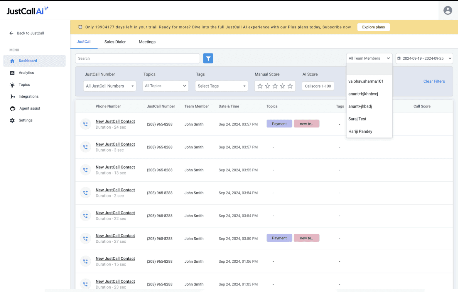
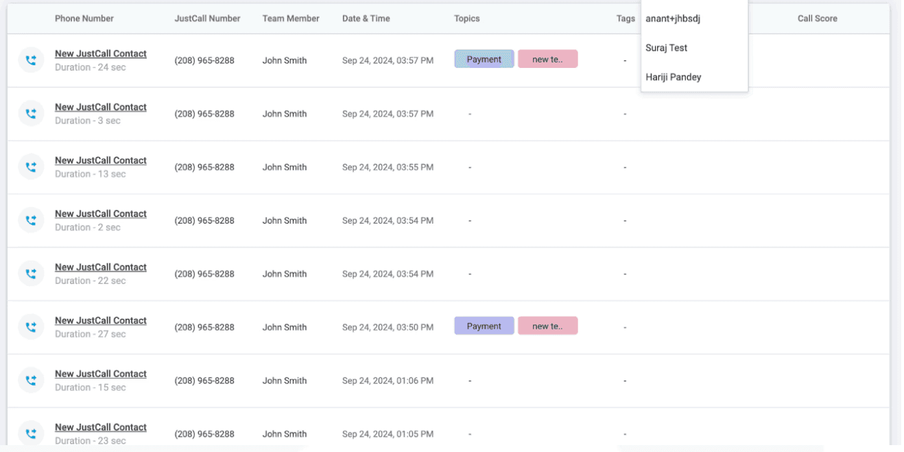
The Filters Section:
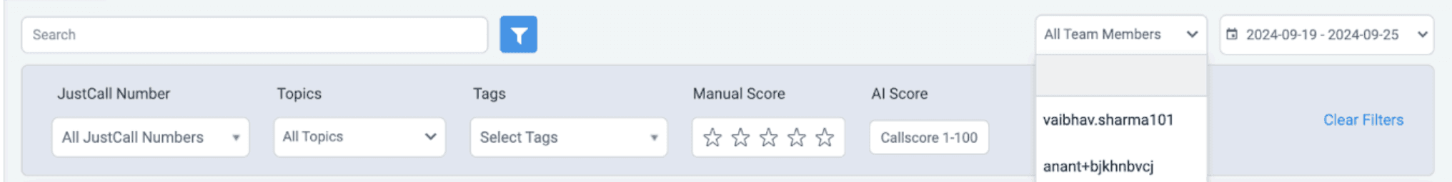
UX Issues:
The dark background increases cognitive load, making it harder for users to quickly process and focus on the filter options.
There is a lack of visual hierarchy, as some filters are positioned at the top right, while others are at the bottom, causing inconsistency and confusion in the layout.
The absence of a search functionality in the dropdown makes it difficult for users to efficiently find a specific team member, especially in large datasets.
Presenting too many options upfront overwhelms users, leading to decision fatigue and reduced usability.
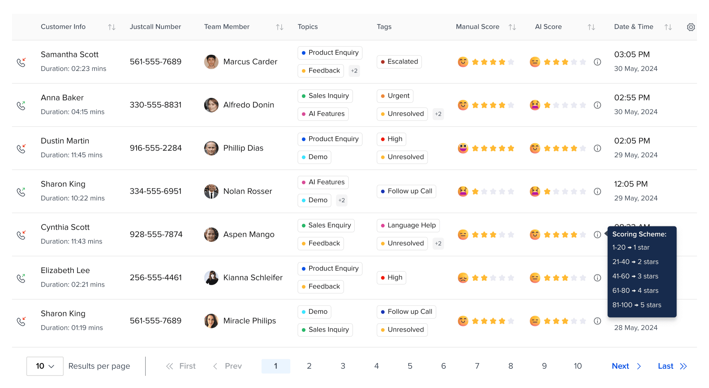
Measuring Parameter for Manual Score & AI Score:
Manual Score deals with scores from 1 to 5 star, whereas AI Score ranges from 1 - 100
The disparity between the manual and AI scoring systems creates significant challenges in evaluating performance consistently. The parameters used for each score differ in both scale and structure, which leads to confusion and potential inconsistencies when comparing the two.
These differences in scoring mechanisms make it difficult to assess whether the AI is truly performing at the same level as manual evaluations or if there are underlying discrepancies.
UX Issues:
The scoring range between the manual (1-5) and AI (1-100) is not aligned, making it challenging to create a cohesive understanding of performance across both methods.
There is a lack of standardization between the two scoring systems, leading to confusion when interpreting and comparing results.
The weighting and criteria for each score are unclear, which complicates the understanding of how both manual and AI scores are derived and whether they align in their evaluation of performance.
Overall UX Issues:
There are several general issues within the overall dashboard that impact both the user experience and accessibility. These issues hinder the effectiveness of the dashboard and make it more difficult for users to navigate and extract meaningful insights.
UX Issues:
The background colors used throughout the dashboard create a visually heavy and outdated look, which can negatively affect the overall aesthetic and user experience.
Certain design elements do not meet the WCAG Accessibility criteria, making it difficult for users with disabilities to interact with the dashboard effectively and potentially violating accessibility standards.
There is no separate column for Manual Score and AI Score, which complicates the comparison and analysis of the two metrics. This lack of clarity makes it harder for users to quickly identify trends and make informed decisions based on both scoring systems.
💡Learnings so far:
The dashboard currently faces several key UX issues that hinder user experience and accessibility. These include inconsistent visual hierarchy, outdated background colors that make the interface visually heavy.
To address these issues, the next steps should focus on:
Simplifying the visual design by using lighter, modern colors to reduce cognitive load.
Ensuring all design elements meet WCAG accessibility criteria for a more inclusive experience.
Aligning the Manual and AI scoring systems, either by standardizing the scale or providing clear conversion guidelines, to ensure consistency in assessment.
Redesigning the layout to create a clearer visual hierarchy and enhance usability.
🧱 Defining the Layout:
The Filters Section:
The Filters section plays a crucial role in enhancing the user experience of any SaaS application. Filters help users quickly narrow down large data sets and customize the view according to their specific needs.
However, in the current design, all filters are displayed upfront, which can overwhelm users and increase cognitive load. To improve this, the following changes can be made to streamline the process and enhance usability.
Key Improvements:
Show Frequently Used Filters Upfront: Instead of displaying all filters at once, only the frequently used filters should be shown. This reduces visual clutter and minimizes decision fatigue, allowing users to focus on the most relevant options.
🎯 This can be refined with more data and insights
Custom Filter Groups: Introduce the functionality for users to create custom filter groups. This allows them to save frequently used combinations of filters, making it easier to apply them with a single click in future sessions. This feature improves efficiency and personalization, reducing the time spent reapplying the same filters every time the user logs in.
Manual Score and AI Score Comparison:
The discrepancy between the Manual Score and AI Score, with their different scoring ranges (1-5 for Manual and 1-100 for AI), makes it difficult for users to compare and interpret the scores accurately.
To address this, the solution is to normalize the AI score range to match the Manual Score range. By transforming the AI score into a rating scale similar to Manual scoring, users will be able to understand and compare the two scores more intuitively.
Key Improvements:
Normalization of AI Score: Convert the AI score (1-100) into a 1-5 scale, matching the Manual Score range. This will create consistency between the two scores, making it easier for users to interpret both metrics on a comparable scale.
Unified Rating System: Present both the Manual and AI scores as ratings on the same scale (1-5). This will simplify the comparison and help users quickly assess performance without the need for mental conversion between different ranges.
Clear Labels and Indicators: I’ve added sentiment indicators for each rating, making it easier for users to relate to the scores and quickly understand the sentiment behind both Manual and AI ratings.
Consistency in Presentation: Display the scores in a consistent format, ensuring that both Manual and AI ratings are positioned similarly on the interface. This reduces cognitive load and makes it easier for users to scan and analyze both scores.
Contextual Insights: Provide contextual information or tooltips that explain how the AI score was derived and how it compares to the Manual Score, offering transparency and helping users trust the AI’s evaluation.
🎨 Setting up the Color Palette, Typography, and Grids:
When beginning the redesign process, establishing a strong foundation in terms of color, typography, and layout grids is crucial for ensuring a cohesive and visually appealing user interface. These design elements not only set the tone but also help in guiding users through the dashboard in a seamless manner.
Color Palette:
The color palette was designed to be clean and modern, using light background tones to reduce visual strain and vibrant accent colors to highlight key actions and data points. This combination not only improves focus and readability but also ensures the design meets WCAG accessibility guidelines, making it accessible to a wider range of users while providing a visually appealing interface.
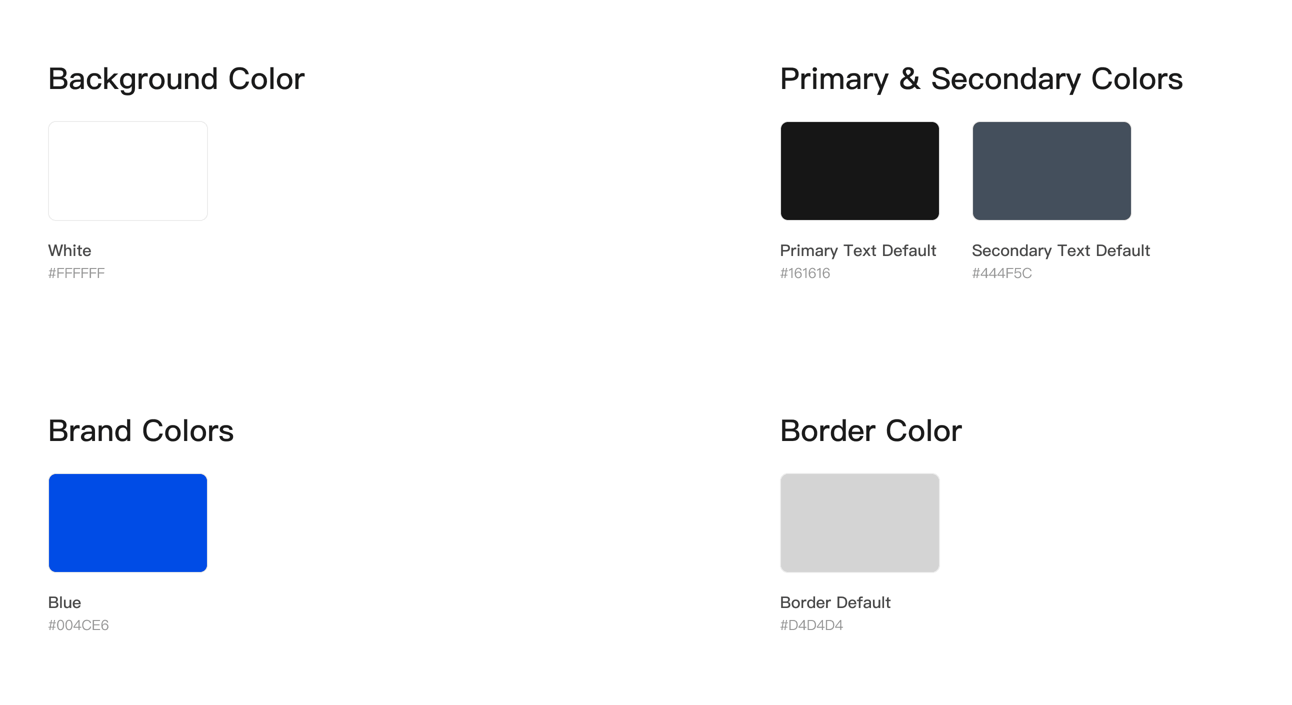
Typography:
I chose Proxima Nova for its clean, modern look and excellent readability, which is essential in SaaS design. Its balanced proportions and geometric structure ensure clarity across all screen sizes, providing a seamless user experience. This font combines professionalism with approachability, making it ideal for displaying complex data clearly and effectively.
Grids:
A 12-column grid system was used to ensure consistent spacing and alignment throughout the dashboard. This flexible layout adapts to different screen sizes, maintaining visual balance and responsiveness. The 12-column structure allows for clear organization of content, improving readability and ensuring a seamless user experience across devices.
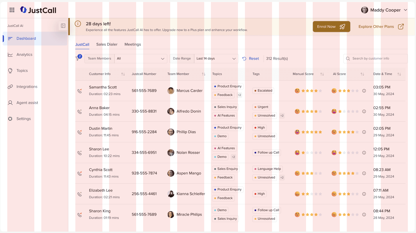
⚜️ Presenting the Redesigned Dashboard:
After several iterations of sketching and exploring different options through paper wireframes...
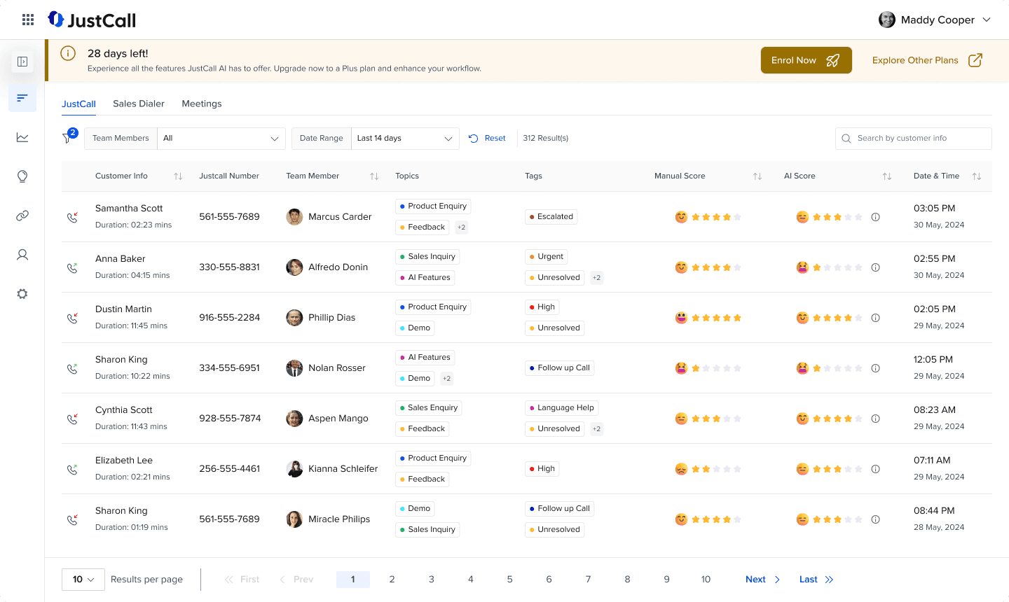
Here is the final design of the dashboard, incorporating all the improvements and solutions discussed. The interface is streamlined, with a clear visual hierarchy, intuitive navigation, and enhanced accessibility. By focusing on user needs and design best practices, the final screen offers an optimized and engaging experience for users.
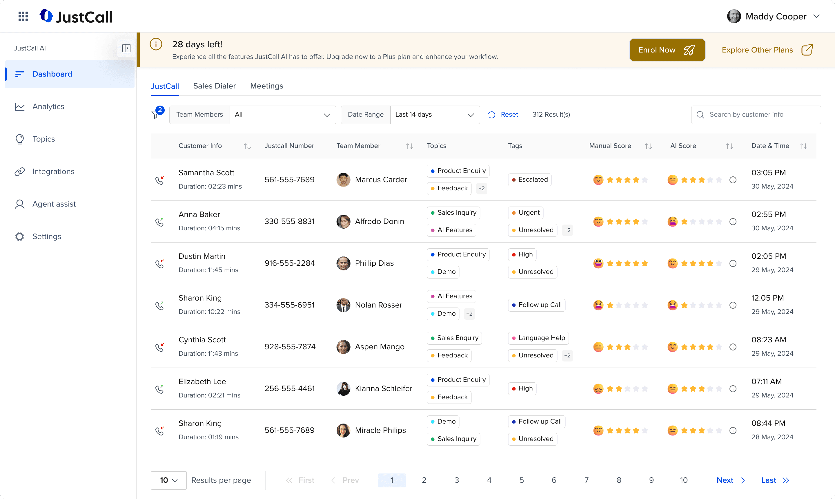
Breakdown of the Solution:
The Banner:
Old Banner:
Updated Banner:

The banner redesign focuses on improving visibility and guiding user action more effectively. By refining the visual hierarchy and making key elements stand out, users can easily understand the message and take the necessary steps.
Visual Hierarchy: Emphasized the remaining days to create urgency.
Clear Call-to-Actions: Added two distinct buttons for upgrading the plan and exploring other plans.
Dynamic Color Change: The banner color shifts as the trial expiration date nears, reinforcing urgency.
The Sidebar:
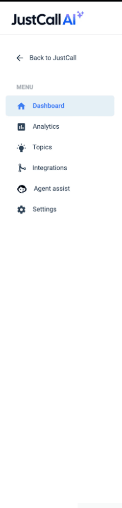
Old Sidebar:
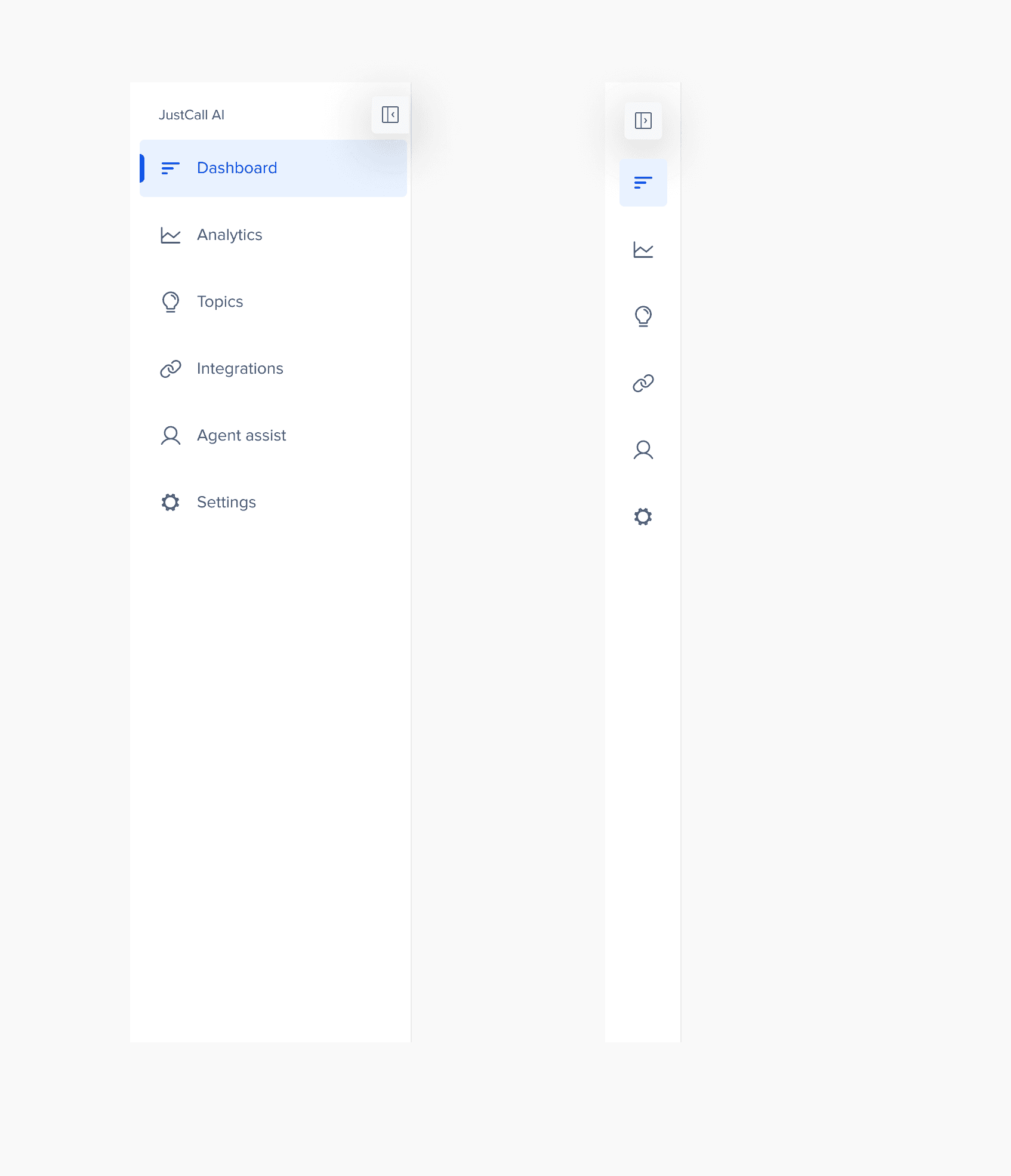
Updated Sidebar:
The sidebar has been redesigned to offer a cleaner, more spacious experience for users. By increasing the white space, the design feels less cluttered, allowing for easier navigation and focus. Additionally, I’ve added functionality for expanding and collapsing the sidebar, giving users the option to maximize their workspace and view the table without distractions.
Increased White Space: Improved breathing or whitespace for a less cluttered look.
Expand/Collapse Functionality: Allows users to toggle the sidebar for a wider table view, which maximizes screen space, enhancing focus and productivity.
The Filters Section:
Old Filters:
Updated Filters:
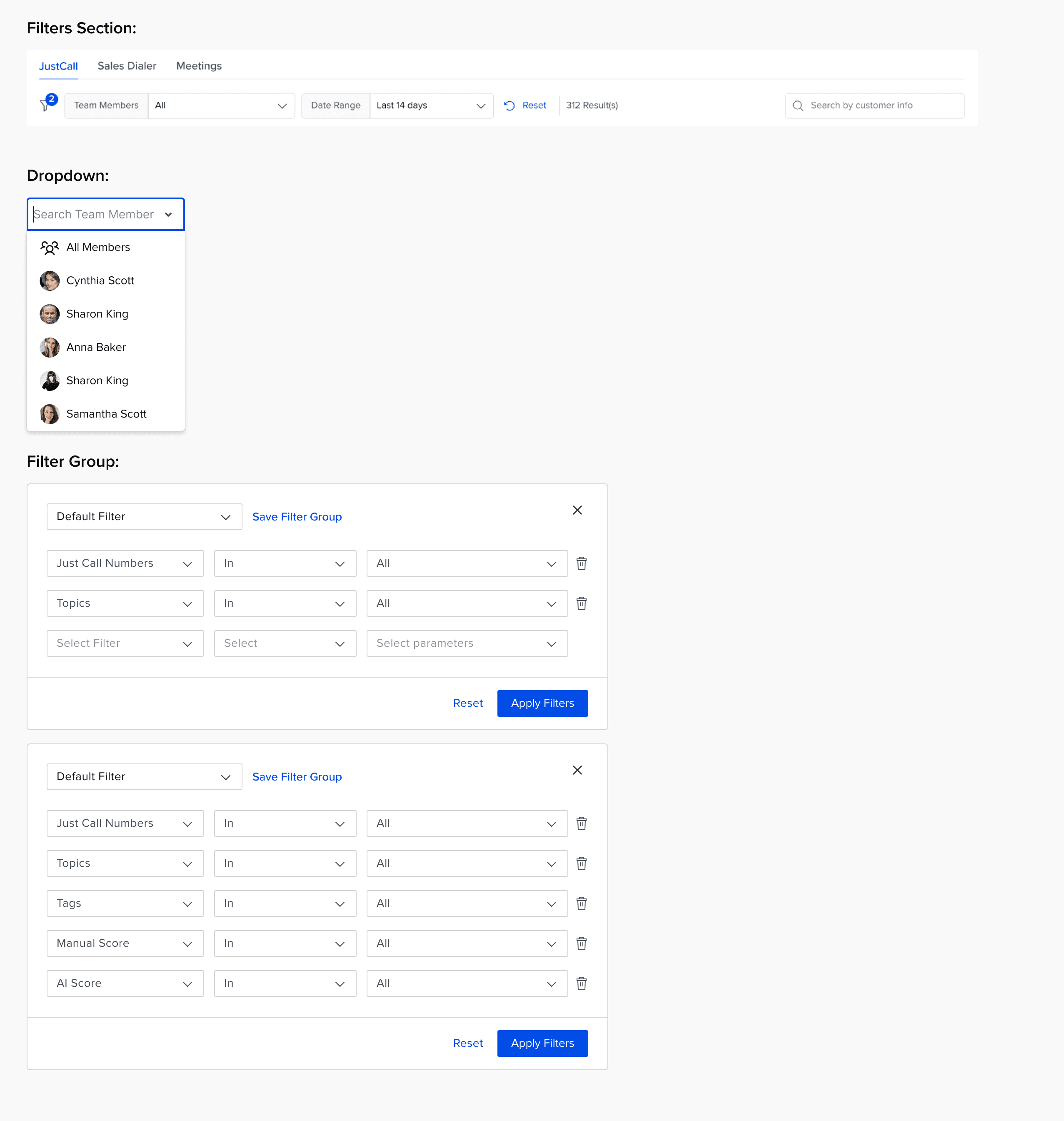
In the redesigned filters section, I’ve streamlined the layout to improve usability while maintaining the flexibility users need to customize their data view. Based on product knowledge, I’ve kept only the main filters visible upfront, while other filters are tucked inside a filter icon.
🎯 This can be refined with more data and insights
Main Filters Visible: Only the key filters are displayed to reduce clutter.
Filter Icon with UI Nudge: Users can see how many filters are applied at a glance.
Search Functionality: A search bar allows users to quickly find specific content within the data.
Advanced Filters: Upon clicking the filter icon, users can access more granular filtering options like "In", "Out", "In Between," etc.
Save Filter Groups: Users can save custom filter groups, so filters are automatically applied when they log in, saving time and effort.
Reset Filters: Users can easily Reset applied filters with just one click.
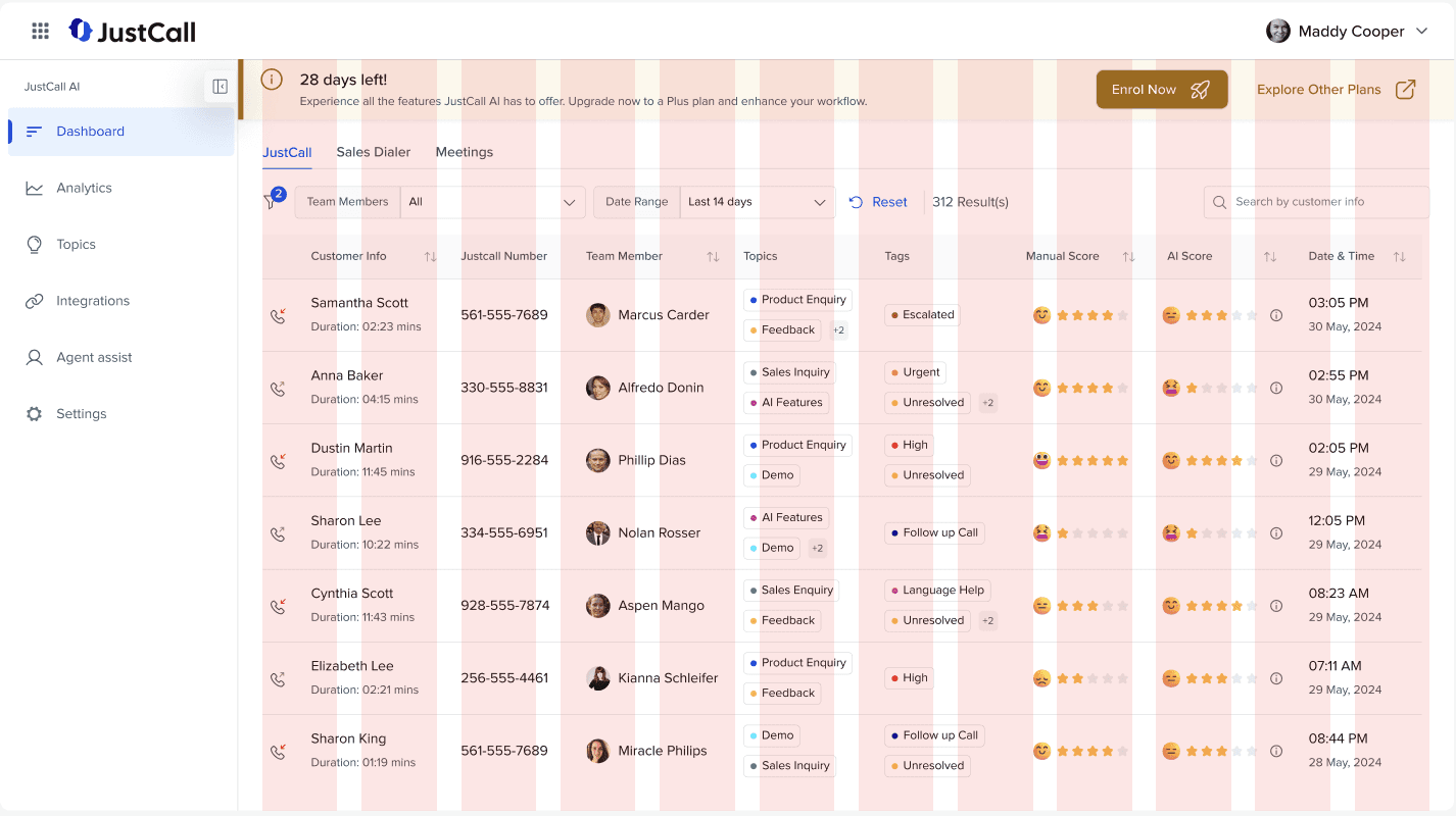
The Table:
Old Table:
Updated Table:
The table has been redesigned to provide a clearer, more accessible view of the data with key improvements focused on usability and clarity.
Minimalistic Design: Removed background colors to create a clean and minimalistic look, improving focus on the content.
Data Sorting: Added sorting functionality within the column headers to easily sort out the data.
Manual and AI Score Columns: Separate columns for Manual Score and AI Score allow managers to easily compare and identify deviations.
AI Score Breakdown: Hovering over the info icon provides a detailed breakdown of the AI score, giving users more context and transparency.
Topic and Tags: Clear tags for Topic and Tags columns improve readability. If the number of tags exceeds the visible space, a number tag indicator appears like "+2", with additional tags shown on hover.
Call Type Icons: Respective icons are used to differentiate between incoming and outgoing calls, enhancing clarity at a glance.
Sentiment Emojis: Emojis are used to represent sentiments, helping users quickly relate and understand the context.
Pagination: Added pagination at the bottom of the table, allowing users to easily navigate through large datasets.
Following the Norms:
12 Grid Column Structure for the dashboard screen
12 Grid Column Structure for the inner screen
Final Screen:
Expanded Dashboard:
Collapsed Dashboard:
Conclusion and Future Work:
Within the timeline of two days, I was able to understand the product and identify key areas for UX improvements that will enhance the overall user experience. These changes, from simplifying the filter section to clarifying the distinction between Manual and AI Scores, are designed to address pain points and make the dashboard more intuitive and user-friendly.
Future Work:
Conduct Thorough User Research: Perform in-depth research to better understand user personas, their behaviors, goals, and pain points, ensuring that the design is fully aligned with user needs.
Map Out Insights with HMW’s: Based on research findings, map out key "How Might We" questions and use them as a foundation for designing solutions that are data-driven and user-centric.
Add Metrics to the Top Header: Incorporate key metrics in the top header to provide managers with a consolidated view of ongoing activities, based on further research into their specific needs.